
Daniel’s Journal #28 – Adventures in Formatting

Good morning, writers, readers, and human beings. I’m going to address those self-publishing authors or those who plan on self-publishing their work. If you’re querying, not a writer, or just feel you’re above the act of publishing yourself, you can read anyway. You may find something helpful.
Formatting. Amazingly enough, it is often overlooked. You’ve written your book, have had it edited, and you are ready to release it into the world. But is your book really ready?
I’ve purchased and read a number of independant authors, and I’ve conversed with those who purchase from indie authors as well. It seems to be a common theme among self-publishing authors that one or more aspects of formatting become overlooked.
As a writer, your focus is the story, and that’s what it should be. But as a publisher, you need to look at the whole picture. You can have the greatest story ever put on paper, but if it looks bad, your sales will suffer. I’ve seen good books get bad reviews based on nothing more than missing formatting.
I’m not going to get into editing here. Yes, you need that too. Don’t think you can get away without it. That’s another lesson for someone else to give.
I’ve been honing my skills at graphics and formatting for years, teaching myself by trial and error how to craft a cover, get the fonts right, finding the right tools for the job, and making my books as aesthetically attractive as possible. You may not think it’s important, but it is. Trust me, you’re not alone in feeling that it’s a bunch of bullshit. There are a lot of writers who believe their stories are so good that the formatting doesn’t matter (they’ve said as much to me). Sometimes you need to check your hubris and realize your book isn’t just about you. It’s about your reader too. Anyone snobby enough to feel that way probably didn’t get this far in this post anyway.
Anyway…
Here’s my quick and dirty list of formatting goals you need to keep in mind. Write them down. Print them. Don’t forget them. As I said, you’re the publisher now. No one is going to do this for you (unless you pay them).
I just want to start (or continue) by saying that I’m not going to tell you how to do these things. There are too many writing programs out there. If you can’t figure it out, you can use their help files or Google it. I use Word like a basic bitch, but it’s what I used to learn, and I know all the shortcuts.
Some of this you can do as you write, but a lot of it should be done after your final edits are complete. It can be a pain to change it later in the process.
OK… Here’s the list.
-Cover
I’m working from the outside in. Your cover art should be original, pertinent to your story, catchy, and contain the name and author. This is basic stuff. Spine and back cover are also important to make your book look good. Amazon has tools to make this easy, but it’ll look much better if you do one yourself or find someone who can help you do a custom cover.
Don’t use images you don’t have the rights to either. Buy it, make it yourself, or find a site with copyright free images and vector graphics. I use Pixabay myself. There are other sites that only ask you to credit the artist or photographer.
-Title Page / Legal Info
Pretty much, page one. A nice title splash on your first page can be anything. I go for black and white vector graphics and a choice font made as a picture file fitting my page. There are also plenty of font packages you can buy or find for free.
I’m not sure what that second page is technically called. I put the IDSN number here along with the disclaimer and editor / cover artist info (if it’s not me). You can also add an “also by” list of your other published works here. Any more than one page here is obnoxious.
-Page Width / Height
You should probably know this first. It will determine your cover size as well. Amazon has many sizes for self-publishing, 6×9 listed as the most popular. I like 5×8 better, as it fits in my hands better and feels more portable. You can size the pages in your document so you can see how the book fits by changing the paper size to the dimensions of your planned book. You have to do this before uploading the manuscript if you’re using Amazon KDP anyway, but it may help to write it this way too. That’s what I do.
-Margins
Use margins properly. Too much on the left and right, and your writing has too much white emptiness on either side. Too little, and your words get too close to the middle and they are hard to read (see the next paragraph on gutters). You need to leave room at the top and bottom too for headers / footers, but don’t take up too much space! A half an inch respectively should be plenty. Empty space in a book is the enemy!
Make sure you’re using the right amount of space for your gutter, too! Amazon won’t correct this for you, and there are other places that will flat out reject your paperback file over this issue. Again, you can edit this in the margin settings for Word, and that may be the same for other programs as well. When in doubt, Google a tutorial. I do this as the very last step because it’s annoying to draft and edit with those particular margins on the screen, but it’s good to see them before you order your paperback proof.
As a side note (edit on 8/28/23), I was doing this part wrong for a while, and I recently went back and fixed the margin issues, and the books look so much nicer now. It also took less space, and less pages means it costs less to produce, which means you can either sell it a bit cheaper or get a better royalty.
-Font Type and Size and Indents and Blank Spaces in Your Book
Don’t you dare publish your book in comic sans!
Seriously, pick a decent font. Don’t use something fancy you’ve gotten off some website that looks cool but is hard to read. That kind of font might fly for the cover or chapter headings, but not for the meat of your story. Times New Roman is my go-to, and Arial is good too. Anything else tends to annoy readers from what I’ve seen.
Size it properly, too. You don’t need gigantic letters unless you’re making a book for people with bad eyesight. Don’t make it so tiny your reader has to squint either. For a 5×8 book, I go with a 10 font. It looks best on the page this way. You can go for a 12 font, which looks decent if you’re going with the 6×9 paperback size.
While we’re on this subject, make sure you’re not double line-spacing, and for the love of God, do not have that extra space between paragraphs when you publish. Your editor may like them, but your readers will not. Again, blank space is the enemy. As I mentioned in the paragraphs about margins, this will neaten up the look of your book and cut down on the page count.
If you’ve hit enter twice after a paragraph to do the double paragraph spacing, I pity you. That is a bitch to fix. So when you’re doing the double spacing for your editor or drafting purposes, make sure you have the settings do this for the document so you don’t have to waste an entire afternoon or evening fixing it later.
DO NOT EQUATE A HIGH PAGE COUNT WITH STORY QUALITY.
I have one last note for this section since I’m bouncing around fonts on whatnot. Don’t set your indents too deep on your page. You know, blank space… I’ve seen books where the indent is a third of the page, horizontal-wise, and it does get a bit annoying, especially during dialogue scenes. You don’t need a lot here. Just enough to let your reader know you’ve started a new paragraph is good, and it’s such an easy thing to fix.
Page Numbers
This should be obvious, but I see a lot of readers complaining they’re missing. They can go in your header or footer depending on what style you have in mind. Word gives you a few different options, and the other programs probably do too. There’s not much else to say on this one…
Chapter Headings
These may not be too important to you, but I think they look good. Again, you want your book to be as attractive as possible. Here’s what I made for Blood Drive with a free vector graphic and the font tool in my image software:
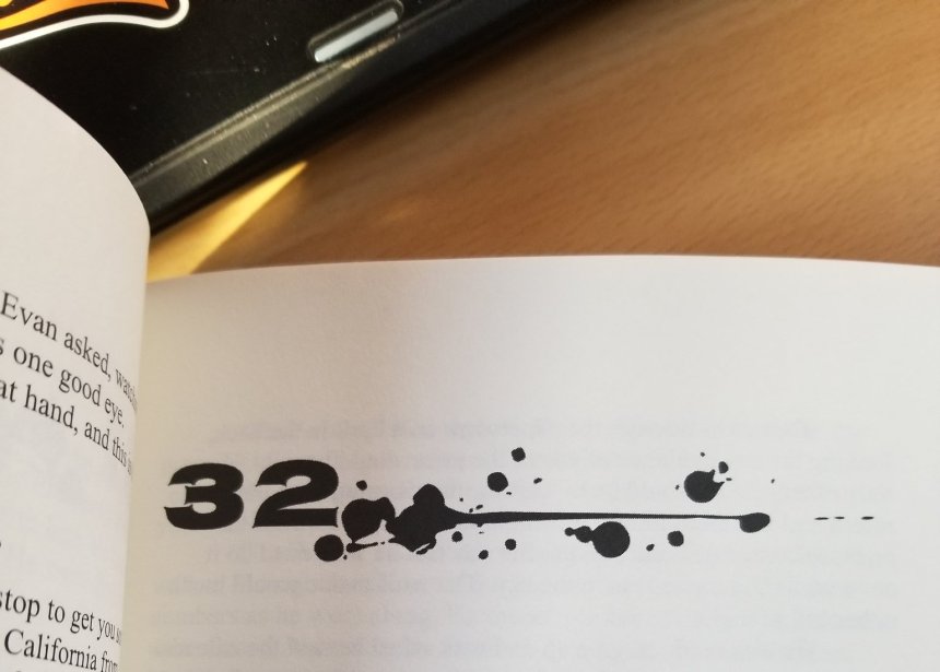
If you can’t do graphics, there are those who can. You can pay someone with the know-how, or you can trade services. I’ll usually trade formatting/graphics for beta reading or editing.
If you don’t want to do this, at least enlarge the font a few clicks. Amazon digital will change certain fonts on Kindle devices to default, so you’ll have to add them as an image if you want them to stay.
-Blank pages
Remove them.
-Page Headers
What’s this? Your book title on the top of the left page, and your name on the right. Keep it off the title page (Word has an option to skip the first page with headers/footers). This is more optional than anything else (those I asked about this were divided), but it gives your book a professional look. Don’t make this too huge, though. I’ve made that mistake and wound up going back to shrink them.
– Justification
This is handy tool to make your text line up against the right margin of the page. It makes everything look much neater. This is probably the most overlooked piece of formatting from my experience as a reader next to double spacing. You can use the auto-hyphenate feature too if you’re into that sort of thing.
-About the Author Page
I debated this one. I hate writing about myself. This should be short and sweet, a few paragraphs. Include your headshot if you want it to be professional. This should be the final page of your book.
****
That wasn’t too painful, was it? I hoped this helped you or pointed a few people in the right direction. If you want to message me on whatever app I’m on, hit me up and maybe I can help out.
Keep up the good work, people.
Daniel Aegan
-2/22/19
****
Want to see my formatting at work along with my debut novel?


Pingback: Daniel’s Journal #68 – Not Sorry for the Misunderstood Controversy I Might’ve Caused on Twitter Recently | Daniel Aegan