
Adventures in Formatting REDUX.

I’ve been debating whether or not to redo and update this old formatting post of mine. I wrote it four years ago when I started self-publishing and noticed that a handful of indie paperbacks I ordered were missing crucial formatting. Without naming names, I have books on my shelf that aren’t justified, kept the paragraphs double-spaced, neglected to add page numbers or headers, or missed something. I’ve conversed with other readers of indie books, and I’ve been told they’ve noticed these things missing as well.
I didn’t write this article to shame anyone, nor am I sitting cockily on my high horse looking down my nose at the authors who put out books I consider incomplete due to missing formatting. Some of these things can be easily overlooked, and I’ve done it myself since self-publishing my first paperback Blood Drive in 2019. Since I’m fallible myself, I did miss a few things, but I’ve fixed these and resubmitted the manuscripts with corrected formatting.
The original intent of my Adventures in Formatting post was to address those, like me, who are self-publishing or planning on doing it in the near future. This list may still be helpful if you’re going to be querying your books or want this knowledge for work papers or school reports. I don’t know if it’ll help with those things, but it shouldn’t hurt to have your writing look good. Either way, you may find something helpful.
To dive into things, formatting is amazingly overlooked by a lot of first-time and regularly self-publishing authors. By the time you’re getting ready to publish you’ve written your book, drafted it a few times, and have had it edited. Now you’re ready to release your book into the world, but you may have missed a crucial step.
As a writer, your focus is the story, and that’s what it should be. But as a publisher, which you are at this point in your journey, you need to look at the whole picture. You can have the greatest story ever put on paper, but if it looks bad, your sales will suffer. I’ve seen good books get bad reviews based on nothing more than missing formatting.
I’m not going to get into editing. Yes, you need that too. Don’t think you can get away without it as I’ve seen some authors claim. That’s another lesson for someone else to give.
I’ve honed my skills in graphics and formatting for years before and after I started publishing, teaching myself by trial and error how to craft covers and internal graphics, use the right fonts, find the right tools for the job, and make my books as aesthetically attractive as possible. One may think it’s not important. Trust me, if you think this way, you are not alone in feeling like I’m spewing a bunch of bullshit here. You’d be wrong but not alone. A lot of people believe their stories are good enough and the formatting doesn’t matter. They’ve told me themselves on more than a few occasions. Sometimes you need to check your hubris at the door and realize your book isn’t all about you. It’s about your readers as well. Anyone snobby enough to feel this way probably didn’t get this far into this article, so we don’t have to worry about them for sake of moving forward.
So, without any future buildup, here is my quick and dirty list of formatting steps you should keep in mind when putting together the final version of your book—as if anything is ever final… Take some notes, write them down, or print them. Whatever you do, don’t forget them. As I said, you’re the publisher now. No one will do this for you unless you pay them.
My last point here is that I can’t tell you how to do everything listed here. There are too many writing programs and word-processing tools that I don’t know. If you can’t figure it out, check the help files in your program or Google it. I use Microsoft Word like a basic bitch since it’s what I used to learn way back before I even considered self-publishing, so I knew some shortcuts already. Some of what’s on this list you can do while writing, but most of it comes during later drafts. It can be a pain to format early and be forced to change it later. Trust me on this. I’ve learned this the hard way myself, but that seems to be the only way I can learn anything.
As promised, here is the list:
Cover
I’m working from the outside in. Your cover art should be original, pertinent to your story, catchy, and contain the name and author. This is basic stuff. The spine and back cover are also important to make your book look good. Amazon has tools to make this easy, but it’ll look much better if you do one yourself or find someone who can help you do a custom cover. I use a wrap-around cover since you don’t have to measure out the lines. It sounds lazy, but it also looks better if you do it this way as well. Bonus!
Don’t use images you don’t have the rights to use. Buy it, make it yourself, or find a site with copyright-free images and vector graphics. Some sites only ask you to credit the artist or photographer. Using AI-generated images counts as copyright infringement if it’s pulling from the art of others. I’m not adding a rant about AI art here, but I will say to avoid it like a bad cliché.
Title Page, Legal Info, and Dedication
Pretty much the first and second pages that you should probably keep unnumbered. A nice title splash on your first page should be the book’s title and your name and possibly a black-and-white vector graphic if you want it to look extra fancy.
As a note here, make sure you’re using fonts you have the right to use as mentioned with the imagery. There are plenty of font packages you can purchase or are free to use and quite a few sites that host them. You can even narrow your search on some sites to show those fonts that you can use for free. Keep this in mind for headers and everything else as well.
I’m not sure what the next page is called, but I’ve always called it the “legal page”. I usually have the IDSN number here along with the disclaimer about how all my names and places are coincidental. This would be a decent place for a trigger warning, too, though those should be added to your blurbs as well. You can put the info about your editor or cover artist on this page. I add an “also by” list of my other books to this page. Stretching all this out to multiple pages feels obnoxious to me, but I’ve seen them go to a second page.
Example of splash & legal pages:

FYI: I call the title page a “splash page” based on comic books since that’s what they call the opening page. Please forgive me for this terminology if it doesn’t agree with you.
If you have a dedication for your book, you’d want to add it on the next page. This should be fairly obvious as most modern books have one. You may want to keep these pages unnumbered for aesthetics’ sake.
As one last note here as we’re talking page numbers, you can use the Next Page section break function to start page one where your story actually begins. When you do this, make sure you’re unchecking the box to match with the previous chapter where you want your first numbered page. This is the same for the page headers as well, and we’ll get more into them later. I won’t get into this more since I’m not sure how programs other than Word use this function.
Table of Contents
I do not typically do this unless I’m releasing a collection of short stories. Amazon recommends it for all books, especially ebooks, but it’s in no way required. If you can utilize hyperlinks, you can have an ebook where a chapter is a click away. Again, I don’t use this, so I don’t have a lot to say on this subject, but I’ve seen a lot of tutorials out there for the addition and utilization of links to go back and forth through your ebook. As far as a paperback table of contents, make sure the page numbers are correct before you put your book out into the world. If you change this information, make sure you update your table of contents to reflect the change.
Introduction/Forewords
I don’t recommend these unless you’re writing nonfiction. I’ve seen these go badly for indie writers. Some readers don’t want their experience encumbered by having these ahead of the story, and some will straight up shelf a book at the mere sight of it. There are also readers who do the same if they spot a prologue, but that’s a subject for another article. For the intents and purpose of this article, be careful when dropping these ahead of your story. The only time I ever put a foreword in a book is in short story collections.
I know this doesn’t have a lot to do with formatting, but I felt I should add it here. If you do add an intro to your book, you may want to have a different set of page numbering or exclude it here.
Page Width and Height
You should know this before you start formatting. This will determine your page size and also your cover. There are a wide array of sizes you can use with Amazon’s KDP or any other self-publishing service. The 6×9 size is listed as the most popular. I like the 5×8 for my books since it feels more portable this way. Change the paper size of your document to see how your text looks on the page of your planned book. When you know what looks best for you, save it for uploading. I change the paper size to 5×8 as I write to get a feel of my overall page count. You don’t need to do this yourself if you’re more comfortable keeping it 8.5×11 until you’re ready for the last step.
This, of course, leads directly to our next topic.
Margins
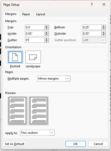
I’ll admit that this is the source of my most recent hangup and why I had to resubmit some of my books. Make sure you’re using your margins properly! These will vary depending on your page count and the size of the book overall. Using the minimum allowed is a good way to frame your page nicely. You don’t want too much blank space in your book!
When formatting for a paperback (ebooks don’t care about margins) make sure you’ve got it set up correctly. The example below is for a 5×8 book with 315 pages. The inside margin should be more due to the gutter in the middle of the book. These dimensions make it fit Amazon’s KPD requirements exactly, so they might be different if you’re publishing with a different company. The top and bottom margins aren’t as stringent, but I don’t like taking too much space away from my story’s text. We’ll look at headers and footers later since those will determine your top and bottom margins.
Font Type and Size
Don’t you dare publish your book in comic sans!
Seriously, though, pick a decent-looking font. Don’t use anything fancy you pulled off a website that looks cool but will take your reader out of the story while deciphering it. It may look cool but it’ll probably annoy your readers. Save that font for your chapter headers but not your story. Times New Roman is my go-to. Arial or something else appealing to the eye works as well.
Size it for the page, too. You don’t need gigantic letters unless you’re making a book for people with bad eyesight. Don’t make it so tiny your reader has to squint, either. For my 5×8 books, I go with a 10 font. It looks best on the page this way. Using an 11 or a 12 is OK, too, especially if you’re using the 6×9. This information is subjective, so do what looks best for you.
Here’s where I admonish you for double-spacing your published book. Don’t do this! It’s good for editing and whatnot, but it leaves too much empty space on your pages, and empty space is the enemy. Make sure your text is single-spaced before you release it into the world.
Page Numbers
You think this would be obvious, but I’ve had a few books come my way without page numbers anywhere on them. I’ve seen readers complain about this from indie authors as well. You have the option to put it at the top or the bottom as well as choosing to left, right, or center justify them. Putting them in the center of the footer is the most common way to do this, but there isn’t a wrong place for them since it’s another one of those subjective quirks.
Page Headers
Since we touched on footers in the last section, now feels like a good place to bring up page headers. You can have your page number up here if you’d like as mentioned. I like seeing the book title and author name up here. Maybe it’s something I got used to after years of reading since a lot of books don’t have it this way. This is one of those subjective things, too, so don’t stress if you’re not going with the flock on this one. You can use a separate header for even and odd pages, so they don’t have to be the same.
Here is an example of page headers:

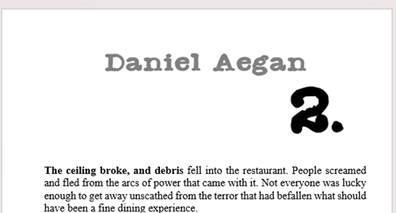
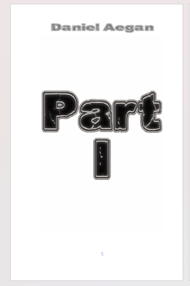
Chapter Headers
You want to mark your chapters in case you have a reader flipping through them. If you have a header the same size and font as the rest of your book, the won’t stand out. This goes for part divisions or short story headers in collections as well, but we’ll lump them all in here.
I find the best way to make a good header is with a black and white graphic. This is how I also do the aforementioned splash pages and page headers. Size it right for your page, and insert the image. If you can’t make the graphics yourself, find someone who can. If you don’t have a friend who’s willing to help, you can hire someone with graphics know-how or trade services like beta reading. I’ve done formatting for friends in the past for similar service trades.
You can always up the font size for paperback, but this formatting may be erased on ebooks. If you add them as images on the page, they can’t be edited or removed on the back end when the digital formatting takes place.
Here are some examples of headers for new chapters, short stories in an anthology, and part dividers from my books:

Blank pages
Remove them.
Justification
This is one of my biggest formatting peeves next to double-paragraph spacing when I pick up an indie book. You want your text to line up against the edge of your right and left margins. It makes the whole book look much neater and polished.
Unjustified:

Justified:

See how much better it looks in the second image! You can also use an auto-hyphenation feature for longer words at the far end of the righthand margin if you’re into that kind of thing.
About the Author Page/Afterwords
I debated whether or not to add this the first time I wrote this article. I hate writing about myself, and I tend to avoid it. I asked a few indie author pals, and the consensus was that this should most definitely be in the book and a part of this article. This section typically comes after our story and should include a short and sweet description of yourself. More than a few paragraphs feels like masturbation, though. Include a headshot if you want it to look extra professional.
You can also add some acknowledgments or an afterword at the end if you’re looking to drop some notes on your reader. If there was anyone who helped or some event that inspired you to write your story, now’s the time to mention them. I once saw a writer get completely eviscerated for putting this stuff ahead of the story, so make sure you’re doing this on the back end.
***
Well, that’s the list. I hope you’ve learned something new or used this to brush up on your formatting skills or at least pointed you in the right direction.
-Daniel Aegan
2/16/2023

Pingback: Adventures in Formatting REDUX. | Daniel Aegan